
Seasonal Floral Design: Creating Arrangements With SEASONAL Blooms
Seasonality is one of the most valuable elements in contemporary floral design — everything from what’s available to the aesthetic appeal of the flowers to how they will hold up all depends on the season. You will have longer-lasting, less expensive and more natural-looking designs if you stay within seasonal boundaries. With each new season comes a new color story, texture, flower language, mechanics, etc.
Because designing seasonally forces you to notice what flowers are available during different times of the year and change up your shapes and designs accordingly, it helps to hone your observation skills. Flexibility is important for any floral designer, and seasonally designing helps students gain confidence and flexibility.
However, there’s more to seasonal flowers than what types are in season. You should also take into account the warmth and coolness of the colors, the movement, the density, the choice of vases and even the silhouettes. Having an awareness of this will allow you to create more thoughtful and harmonious centerpieces.
Guidelines for Choosing Seasonal Materials
But before we dive into the specifics of each season, it’s important to consider the criteria for choosing materials for seasonal designs. Freshness, stem strength, bloom size, and vase life are all affected by the seasons. Choose materials that are thriving in the current weather conditions and temperatures.
There is generally less need to adjust and assist seasonal elements. They will absorb water better and retain their shape better. Greens and branches from your local region are far more hardy than most flowers flown in from out of season.
There is a rule of thumb that suggests that the color direction should be controlled by the light in the season that you’re shooting. For example, in spring when the light is soft and bright you can use a softer color palette, in summer when the light is stronger you can use greater contrasts, in autumn when the light is lower you can use deeper richer colors, and in winter when the light is harsher you can use higher contrasts and a cleaner graphic.
So should texture. It should be soft and lush in the growing seasons and dry, woody, or structural in the rest.
Spring Floristry: New Beginnings and Gentle Movement
The spring season is known for new beginnings, elegance and vertical lines. Usually plants with pliable stems, arc and oval shapes and blending colors are used. Flowers used in the spring season have their own expressions, so fewer materials can be used to make spring arrangements.
The typical color palette for spring is pastel, light green, soft yellow, blush, and soft blue. These colors are often more effective in loose, open arrangements where stems can be seen. Spring flowers are not effective when jammed together.
Especially important for spring designs are branch materials that have buds. These add height and movement, and further emphasize the seasonal character of budding. Bulb flowers are often used, and generally require shallow water and less removal of foliage.
For a spring arrangement, choose a light-colored or clear container. A shape that the stems can be seen through is great for spring. Spring arrangements also favor asymmetry and negative space.
The Practice of Summer: Fullness and Dynamism
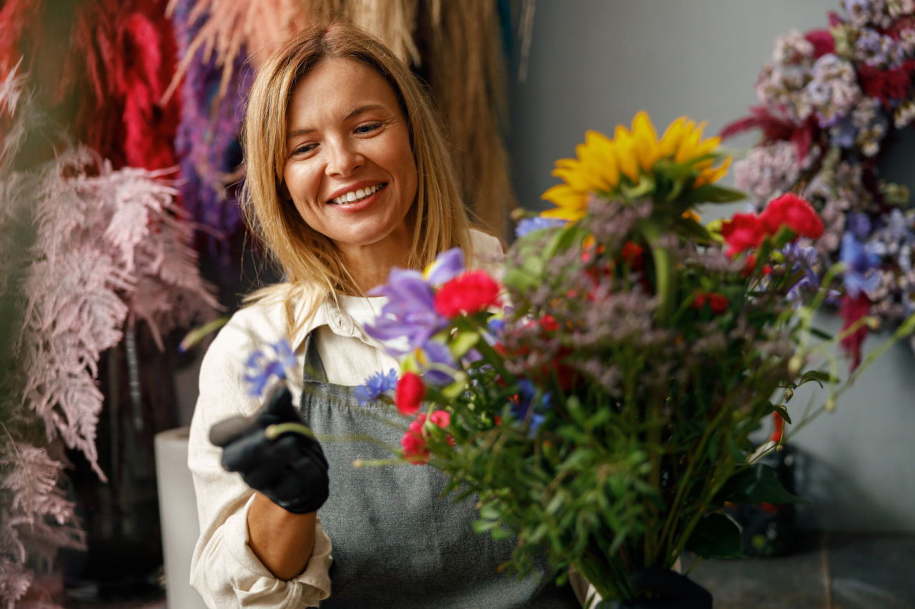
Summer flowers are lush, richly pigmented and hardy. The stems are taller and heartier making it easier to make bigger and more architectural designs. Summer is perfect for abundance, movement and striking focal points.
Bright and contrasted color schemes. Warm colors like yellow, red, orange, fuchsia and green look great in the sunlight. It’s better to play with complementary color schemes in summer, as these colors already carry enough contrast for the season.
Summer means it’s especially important to pay attention to hydration. Thick stems should be recut, and the water holding systems within designs should be trusted. Foam or water-holding mechanisms are often used in summer event work because of the heat.
While there may be a lot of summer foliage to work with, you can use it to build mass and form, which can later be accented with statement blooms. It’s a great way to add volume and keep larger structures secure.
In the summer, the outline of designs can be more rounded or spread out but you should still try to keep a clear focal point so it doesn’t become too busy.
The Art of Fall Floral Arranging: Texture, Layering, and Warmth
The elements and principles of fall design tend to incorporate a lot of texture, warmth, weight and mass. Plant material frequently used in fall designs are seed heads, berries, grasses, branches and fall foliage color. The flowers used in the fall may be more dense and compact compared to the spring and summer arrangements.
There is also a move toward warm and muted colors such as rusts, burgundies, deep oranges, golden yellows, plums and browns. Since these colors are heavier, you need to be mindful of balance. Too many dark colors in one arrangement will make it look squatty.
Fall is the perfect time for a combination of fresh and dried flowers and foliage, where texture plays a leading role in the arrangement. For example, velvet flowers with their smooth petals can be blended with pods with their rough texture and ornamental grasses with their feathery plumes.
Structure and mechanics can be more apparent and communicative in fall garments. Scaffolds of twigs and branch constructions may be highlighted in garments rather than structural elements.
In the fall, we lean toward heavier and darker or more textured vessels — things like ceramic, wood, metal, and stone. We also prefer shorter, chunkier vessels, which add to the weightiness of the season.
Since branches are typically bare during the winter months, let’s revisit the principles of line and contrast and keep minimalism in mind as we arrange them.
During the winter season, the focus tends to be more on lines, shapes, and textures. Because flowers may be more limited in some areas, a lot of evergreen, branches, dried material, and feature flowers are used.
We often see whites, emerald greens, crimson and deeper neutrals. High contrast schemes are ideal for the low light of winter. Monochromatic schemes are great too, particularly if texture contrast is high.
Evergreen boughs offer solid structure and longevity. They can also be used to create the skeletons that hold a few big blooms. In winter arrangements, clean lines and good proportions are good.
Since winter interest materials are often rigid or woody, it is important to consider the mechanics of their use. Building frameworks for these elements before planting helps avoid stem damage and makes planting more precise.
Simple and small is often found in winter arrangements. Less is more and proper placement is key to giving an elegant and clean look. Negative space is also another essential element in a winter arrangement.
Seasonal Structural Changes
Stems also respond to the changing seasons, so your arrangement has to accommodate that. Spring stems are usually flexible and can handle a little less support. Summer stems are often robust and self-supporting (but may require more water management). Fall stems can be delicate or have heavy seed heads that require additional anchoring. Winter stems may need to be pre-drilled, wired, or supported by a heavier base.
Similarly, the height and density of the arrangement should change with the season. In light seasons, the arrangement should be more open and loose, while in heavy seasons, it should be more dense and clustered. By knowing this, beginners will not try to create the same style arrangement all year.
For example, mechanics can support, rather than resist, seasonal actions. Materials that are permitted to do their natural thing result in better-looking, longer-lasting pieces.
Seasonal Color Plan
Before selecting flowers, seasonal designers typically start by selecting colors. Actually, scratch that. What they really do is look at what’s available, and develop color palettes based on whatever looks and feels the best.
A good starting point for beginners is the three-level palette: dominant colour, secondary colour, and accent colour. It’s applicable to any season and evokes different feelings based on the warmth and saturation of the colours.
The color of the accent flower should be repeated, in small proportions, in other parts of the arrangement for balance. The color of the seasonal greenery is also part of the color scheme.